Advanced Typography - Task 1:Exercises
31/08/2022 - 07/10/2022 (Week 1-Week 6)
Yong Kai Yi (0352826)
Advanced TypographyTask 1 / Exercises: Typographic Systems & Type & Play
LECTURES
Week 1/ Introduction & Briefing
During the first week (31/08/2022) is public holiday, so we don't have classes during the day. Despite the holiday, Mr.Vinod posted an instruction video to brief us regarding our task. First, Mr.Vinod brief us about the Facebook group, Module Information and the task we needed to complete by next week.
Lecture 1: Typographic Systems
31/08/2022 (week 1)
Eight major variations of typographic systems:
- Axial
- Radial
- Dilatational
- Random
- Grid
- Modular
- Transitional
- Bilateral
The similarities between typographic systems include the fact that each system has an unique set of rules and a clear goal that concentrates and directs decision-making.
fig 01: axial system example
Axial System: Every element is arranged on either the left or the right side of a single axis.
fig 02: radial system example
Radial System: All elements are extended from a point of focus.
fig 03: dilatational system example
Dilatational System: All elements expand from a central point in a circular fashion
fig 04: random system example
Random System: Elements appear to have no specific pattern or relationship.
fig 05: grid system example
Grid System: A system of vertical and horizontal divisions.
fig 06: transitional system example
Transitional System: An informal system of layered banding.
fig 07: modular system example
Modular System: A series of non-objective elements that are constructed in as a standardized units.
fig 08: bilateral system example
Bilateral System: All text is arranged symmetrically on a single axis
Week 2/ Typographic Composition
Lecture 2: Typographic Composition
(07/09/2022)
Principles of Design Composition: emphasis, isolation, repetition, symmetry, asymmetry, alignment, perspective, rhythm, contrast.
fig 09: principles of design - emphasis
fig 10: the rule of thirds
A photographic guide to composition, a space can be divided into 3 columns and 3 rows. The intersecting lines are are used as guide to place the points of interest.
fig 11: environmental grid
fig 12: form and movement
Week 3/ Context & Creativity
Lecture 3: Context & Creativity
14/09/2022
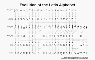
fig 13: evolution of Latin Alphabet
Handwriting is important in the study of typography because it is the first mechanically produced letterforms were designed to directly imitate handwriting.
The western world would start reproducing many of its ancient texts as an outcome of the digital revolution, and type foundries would produce, market, and sell or license them. It is great and instructive that the significance of these ancient letterforms has been acknowledged.
Week 4/ Designing Type
Lecture 4: Designing Type
21/09/2022
General Process of Type Design:
1. Research: Understanding type history, type anatomy, and type conventions is important when designing typography. Terminologies, side-bearing, metrics, hints, etc. need also be understood. We should also examine existing fonts that are presently being used for inspiration/ideas/reference/context/usage pattern/etc.
2. Sketching: Some designers use either traditional tool set (brushes/ pens, and papers) or digital tool set (drawing tablet). Digital tool set is much quicker. persistent and consistent, but it sometimes obstructs the organic hand strokes.
3. Digitization: Leading software including FontLab and Glyphs App. There are designers using Adobe Illustrator to design the letterforms and then import them into the specialized font apps.
4. Testing: The results of testing is part of the process of refining aspects of the typeface. Prototyping is also part of the testing process and it leads to important feedbacks.
5. Deploy: There are always teething issues that were not evident during the prototyping and testing stages, even after a typeface has been deployed. Therefore, revision work doesn't cease with deployment.
fig 14: typeface constructions
Roman Capital: The grid consists of a square and a circle inside it that just touches the square's lines four times. There is a rectangle inside the square as well. The center of the square is occupied by this rectangle, which is three quarters the size of the square.
Using grids (with circular forms) can make building letterforms easier and is one way to build, create, or design your letterform.
INSTRUCTIONS
Module Information Booklet:
fig 15: module information booklet PDF
TASK 1/ EXERCISES: Typographic Systems & Type & Play
31/08/2022 - 21/09/2022 (week 1 - week 4)
WEEK 1 - WEEK 2 (31/08/2022 - 07/09/2022) : Typographic Systems
InDesign Formatting:
fig 16: screenshot of tutorial videos (week 1/ 31/08/2022)
Tutorials to refresh what we have learnt in previous semester and demonstration using Axial system.
Progressions:
fig 17: formatting title of the text (week 1/ 31/08/2022)
I chose Adobe Caslon Pro Bold as the title typeface, to make it more obvious. Following the video tutorials, in order to create Axial system, need to align to single axis, thus I aligned the title to right. The point size is 48pts and leading is 50.5pts.
fig 18: formatting text (week 1/ 31/08/2022)
Next, changing the paragraph spacing between the date and names in order to associate the information into two batches (according to the text information given). Thus, the spacing between information of "June 24" and "June 25" have an obvious gap, so the information can be separated. Another way to associate the information is changing the title to bold or italic.
Explanation regarding the modular system in Adobe InDesign. First, we need to create guides and columns.
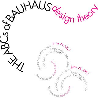
I decided to divide the information into three sections, thus I placed 3 focal point to create the radial system for each in both left and right sides. I chose Futura std, and the lecture title as the information I'll like to highlight.
Modular system tutorial:
fig 19: screenshot of tutorial videos (week 1/ 31/08/2022)
1st attempt progressions:
fig 20: screenshot of radial system progressions (week 1/ 31/08/2022)
fig 21: screenshot of dilatational system progressions (week 1/ 31/08/2022)
fig 22: screenshot of dilatational system progressions (week 1/ 31/08/2022)
fig 23: screenshot of random system progressions (week 1/ 31/08/2022)
fig 24: screenshot of modular system progressions (week 1/ 31/08/2022)
fig 25: screenshot of transitional system progressions (week 1/ 31/08/2022)
1st attempt outcome:
fig 26: merged artboards jpeg (week 1/ 31/08/2022)
fig 27: random system (week 1/ 31/08/2022)
fig 28: transitional system (week 1/ 31/08/2022)
fig 29: bilateral system (week 1/ 31/08/2022)
fig 30: dilatational system (week 1/ 31/08/2022)
fig 31: grid system (week 1/ 31/08/2022)
fig 32: modular system (week 1/ 31/08/2022)
fig 33: radial system (week 1/ 31/08/2022)
fig 34: axial system (week 1/ 31/08/2022)
2nd attempt progressions:
fig 35: screenshot of axial system progressions (week 2/ 07/09/2022)
fig 36: screenshot of axial system progressions (week 2/ 07/09/2022)
After the feedbacks session, I try start from a diagonal line and create a 'zig zag' -ish look, but I prefer layout align straight so I ended the axis in 90degress to place the information which includes more words, and line length.
fig 37: screenshot of random system progressions (week 2/ 07/09/2022)
I started with the tittle "All ripped up:", I lengthen the stem of letter 'p' using direct selection tool, after creating outline. Then I align the other words from the title below it with the lengthen stem. Then I decided to fill in most of the negative space, to make it more overwhelm.
fig 38: screenshot of radial system progressions (week 2/ 07/09/2022)
fig 39: screenshot of radial system progressions (week 2/ 07/09/2022)
fig 40: screenshot of grid system progressions (week 2/ 07/09/2022)
fig 41: screenshot of dilatational system progressions (week 2/ 07/09/2022)
Type>Type on Path> Options> tick Flip to type inside the circle.
fig 42: screenshot of dilatational system progressions (week 2/ 07/09/2022)
For the title I use Futura and the texts/information below using Univers std.
Final outcome in PNG:
(changes made for Axial, Radial, Dilatational, Grid, Modular and Random)
fig 43: axial system (week 2/ 07/09/2022)
fig 44: radial system (week 2/ 07/09/2022)
fig 45: grid system (week 2/ 07/09/2022)
fig 46: modular system (week 2/ 07/09/2022)
fig 47: dilatational system (week 2/ 07/09/2022)
fig 48: random system (week 2/ 07/09/2022)
fig 49: bilateral system (week 2/ 07/09/2022)
fig 50: transitional system (week 2/ 07/09/2022)
Final outcome in PDF:
fig 51: final outcome in PDF (week 2/ 07/09/2022)
fig 52: final outcome in PDF with grids (week 2/ 07/09/2022)
WEEK 2 - WEEK 4 (07/09/2022 - 21/09/2022) : Type & Play (pt.1)
Part 1: Finding type - We are assigned to find a selection of image between man-made objects or structures and nature. We need to analyze, dissect and identify potential letterforms within the dissected image. The forms would be explored and ultimately digitized.
Images chosen:
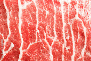
fig 53: texture of a raw meat from GOOGLE (week 2/ 07/09/2022)
fig 54: texture of a cabbage from GOOGLE (week 2/ 07/09/2022)
fig 55: closed-up of a Jajangmyeon from my gallery (week 2/ 07/09/2022)
fig 56: 1st attempt tracing (week 2/ 07/09/2022)
This is my 1st attempt exploring letters from the texture of the cabbage.
Then I tried to find more letters, and decided to find my name, "JAMIE". After finding all the letters, I decided to explore more different forms.
fig 57: 2nd attempt tracing (week 2/ 07/09/2022)
fig 58: letter J tracing (week 2/ 07/09/2022)
fig 59: letter A tracing (week 2/ 07/09/2022)
fig 60: letter M tracing (week 2/ 07/09/2022)
fig 61: letter I tracing (week 2/ 07/09/2022)
fig 62: letter E tracing (week 2/ 07/09/2022)
fig 63: dissected letters (week 2/ 07/09/2022)
I decided to choose the 1st letter J, A, I and E, the 3rd letter M.
In the previous attempts, I was only using lines, in that case it makes the refining process more limited, the anchor points I can edit are limited, so I decide to make it with fill and outline.
The development of the letters from the 1st attempt to 4th attempt.
2nd attempt of tracing and extraction of letters:
fig 64: refer to Futura std (week 2/ 07/09/2022)
At first, I was planning to refer Futura std, then I realized the width is too narrow for the type.
fig 65: refer to Univers std roman (week 2/ 07/09/2022)
Thus, I chose Univers std Roman as reference for the type. I think it's more decent for my type as a reference in terms of width, height and so on.
fig 66: 1st attempt (week 2/ 07/09/2022)
In the first attempt, I adjusted the stroke width and height, make sure the strokes are straights.
fig 67: 2nd attempt (week 2/ 07/09/2022)
In the second attempt, I tried to make them look more simplistic and clean.
fig 68: outline and fill (week 2/ 07/09/2022)
fig 69: outline and fill (week 2/ 07/09/2022)
Outcomes:
fig 70: 1st attempt to 4th attempt (week 2/ 07/09/2022)
fig 71: final outcome (week 2/ 07/09/2022)
fig 72: tracing progress (week 3/ 14/09/2022)
After the feedbacks sessions, I zoomed in more of the cabbage and trace the textures in more detail.
fig 73: referring to Univers std Light (week 3/ 14/09/2022)
Then, after the extraction, I refine the letter by referring to the Univers std Light. But the cabbage textures seems will have thin and thick strokes, not sure if I can refer Univers and also making it as a contrasting type. Thus, I asked Mr.Vinod for suggestions, he suggested me to study Sans Serif fonts with contrast, such as Rotis, Stones Sans and Hesse Antiqua. He also mentioned the strokes are too pointy and straight, the texture of the cabbage still have some round edges, need to trace it properly.
fig 74: tracing progress (week 3/ 14/09/2022)
fig 75: refining progress (week 3/ 14/09/2022)
fig 76: refining progress (week 3/ 14/09/2022)
I use Rotis Semi Sans Bold as my reference, which is a San serif with a contrasting strokes. The extraction is kind of wide and too short, so I adjust them to fit the consistent size before going in detail.
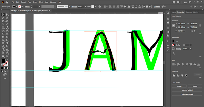
Then, I use direct selection tool and deleting/adding anchor point to make adjustments, in order to maintain the strokes even, I use letter "J" strokes as reference to each letter, make sure the vertical and horizontal strokes are consistent.
fig 77: refining progress (week 3/ 14/09/2022)
fig 78: refining progress (week 3/ 14/09/2022)
fig 79: refining progress (week 3/ 14/09/2022)
fig 80: refining progress (week 3/ 14/09/2022)
fig 81: refining progress (week 3/ 14/09/2022)
Using the letter 'I' as the base of all the letter's stem, in order to maintain the consistency. I use shape builder tool, direct selection tool, curvature tool during the refining progress. I also used pen tool to delete some extras anchor points to avoid irregularity.
3rd attempt outcome (screenshot):
fig 82: 3rd attempt outcome (week 3/ 14/09/2022)
4th attempt progressions:
fig 83: 3rd attempt outcome (week 4/ 21/09/2022)
Final outcome in JPEG:
fig 84: final outcome (extraction vs final attempt) (week 4/ 21/09/2022)
fig 85: final outcome (letter J) (week 4/ 21/09/2022)
fig 86: final outcome (letter A) (week 4/ 21/09/2022)
fig 87: final outcome (letter M) (week 4/ 21/09/2022)
fig 88: final outcome (letter I) (week 4/ 21/09/2022)
fig 89: final outcome (letter E) (week 4/ 21/09/2022)
fig 90: final outcome PDF (week 4/ 21/09/2022)
Showcase:
fig 91: showcase (week 4/ 21/09/2022)
WEEK 4 - WEEK 5 (21/09/2022 - 28/09/2022) : Type & Play (pt.2)
Part 2: Type & Image – Students will combine a visual with a letter/word/sentence of their choosing. The objective is to enhance/support the interplay between the letter/word/sentence and the selected visual. The text must be woven into a symbiotic relationship with the image.
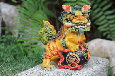
fig 92: picture took for the topic Cultural Prosperity (week 4/ 21/09/2022)
fig 93: picture chosen for the topic Cultural Prosperity (week 4/ 21/09/2022)
fig 94: picture chosen for the topic Cultural Prosperity (week 4/ 21/09/2022)
fig 95: picture chosen for the topic Cultural Prosperity (week 4/ 21/09/2022)
fig 96: picture chosen for the topic Cultural Prosperity (week 4/ 21/09/2022)
Picture chosen from online (backup):
fig 97: landscape
fig 98: landscape
fig 99: landscape
This is a few background I chose to replace the green screen of the picture I took (the statue).
fig 100: landscape
fig 101: landscape
So I chose to edit both theme for "Cultural Prosperity" and "Renewal of Life".
Progressions:
fig 102: changing background
fig 103: masking
Then, I added a layer mask, use brush tool to smooth the edges out.
fig 104: blending options
After the background removal for the prosperity theme, I finished the renewal theme first. I use perspective warp to fit the text on the road. Then, I use "Blending option" to blend the texts.
fig 105: perspective warp
After that, I tried another attempt for the cultural theme, I think it's quite cool to let the text fitting the perspective of the image. But I think it's quite weird in a way as the task is meant to create "text interplay", so I think maybe this concept doesn't fit the title.
fig 106: masking
So, I decided to go for the statue ones. I continue masking, to make the words fit in the image, so I mask the clouds, with lesser opacity.
1st attempt outcomes:
fig 107: 1st attempt (cultural prosperity)
fig 108: 1st attempt (renewal)
2nd attempt progressions:
More research links (recommended by Mr.Vinod):
fig 109: research
Sketches:
fig 110: sketch 1 in progress (cultural prosperity theme)
fig 111: sketch 2 in progress (cultural prosperity theme)
The 2nd design as a back up is boats on the lake, with the lotus leaves, this idea was inspired by a traditional Chinese poster for the beginning of Spring (Lìchūn) from Pinterest.
Outcome:
fig 112: attempt 1 illustration (cultural prosperity theme)
At first, I was focus on this theme and design, but ended up not sure how to interplay the texts into the illustrations, so I decided to go for the 2nd design which I did some sketches previously. I also did showed my design ideas to my classmates to receive some general feedbacks, and decided. I change the theme for the 2nd design to renewal as the illustration with mainly green color palette gives a renew, fresh and hopeful vibe.
fig 113: distorting the texts in AI
I decided to place the text on the boat, and tried the envelope distort but it doesn't work well so I use direct selection tool to manually distort the letters in order to fit in the boat shape.
fig 114: shape builder tool
Using shape builder tool to remove the excessive parts and change colors to create contrast.
fig 115: shape builder tool
Tried more variations on how to interplay the texts.
Outcomes:
The first outcome, the idea is like making the word 'renewal' somewhat visible but not too obvious in a way, so I leave it with a color which is similar with the boat.
fig 117: 2nd outcome
The 2nd outcome, I think it's better if the word is more visible, hence I used cropped them out.
In the third outcome, I added some elements on the corner to make it looks more exciting and interesting.
Final outcome (after feedbacks):
fig 122: foldable wallpaper
fig 123: personalized cards
fig 124: main visual design
PDF jamie:
FEEDBACKS
Week 6 (07/10/2022)
Specific feedbacks: (2nd outcome of the wallpaper). Add some boats and maybe can replace the people to something that represents 'renewal'.
Week 5 (28/09/2022)
General feedbacks: The texts should focus on one specific place ensure it's adaptable to phone wallpaper also. The texts must be related to the image. Wallpaper shouldn't be have too many contrasts.
Specific feedbacks: Choose a less distracting background, another point need to take care of is the treatment, positioning and composition of the letters. Also need more interplay for the texts.
Week 4 (21/09/2022)
General feedbacks: Details are important, irregularity need to be more critical (most instances), requires more intention in detail ,ability of observe.
Specific feedbacks: Getting there, need to soften the edges, not too sharp. Seems ok. Keep in mind whether there is connection in the strokes it's slidely wider in the cabbages stems, maybe can include this in your type.
Week 3 (14/09/2022)
General feedbacks: Remain the characteristics while refining it for consistency. The type outcome should be representative to what we are tracing.
Specific feedbacks: The extractions on the cabbage is not proper and detail enough. The outcome is not representative. (As I asked about the thin and thick strokes) Used wrong reference (Univers std Roman), suggest to study others Sans Serif fonts with contrast, such as Rotis, Stone Sans and Hesse Antiqua.
Week 2 (07/09/2022)
General feedbacks: Consistency, balancing and hierarchy is really important. Utilize the negative spacing well in order to create good balance. Random system is meant to be chaotic but readable at the same time.
Specific feedbacks: Axial system, layout is OK but there is too much negative space at the bottom. Modular system, cannot have unit overlapping each other, the "Taylor's University" text is overlapping to another unit, the dates are fine which are placed within the unit. Dilatational system, point size is quite big, if need to be that big, the leading need to be more, and the layout is kind of awkward. Transitional system, overall is OK. Radial system, layout is OK, but the title "ABCs of Bauhaus" can just line it straight, and make sure to align it to something, aligning is important in typography. Grid system, layout not very overwhelming and memorable, just like islands placing individually, no relationships in between the information. Bilateral system, good job in leading. Random system, not random enough.
REFLECTIONS
Experience
During the 1st week was a public holiday, although we don't have classes, but we still were assigned with tasks. At first was quite clueless, but after watching the refresh tutorial video by Mr. Vinod, it helps a lot. I think it's quite fun while exploring the 8 systems, I was struggle at first as I don't know which layout to go to. Thus, I keep trying different things and explore, placing the texts, play around with it to find a decent layout which also fits the system.
The next task is finding type, the mistake I made in this task is not being careful and didn't get into details. After the feedbacks, I tried another attempt with more care on the details of the stem of the cabbage. The refining progress is find yet time & mental consuming.
Then, type & play. This task we need to use it to submit for HONOR contest also, hence we need to take care of both requirements from the MIB and also the contest, which made me kind of confusing and struggled. The part that tortured me is when thinking what pictures to take, as we can't use pictures from online due to copyright issues. After taking the pictures, I do enjoy the progress of editing in Photoshop and Illustrator. A fun story while I am editing, my father do say it's quite nice and gave me an idea that I can actually hide some part of the letter behind the clouds. I was thinking "wow quite interesting" and I don't mind to try as I was very curious how will it turns out too. Although myself quite love the outcome but it doesn't interplay enough with the main object (which it is the point and aim of this task), so I changed my theme. I use illustration to carry out this task, and it was fun too.
Observation
I found out the random system, although it don't have any specific format or rules, but it was the most difficult ones for me. After the 2nd week feedback session, I tried another attempt and found out it was actually quite fun.
I found out details is very important, although this already being mentioned by Mr.Vinod since previous semester, but I still made the mistake and I feel so bad.
Research and keep trying always is very important when it comes to design. The progressions are very important and precious, every step meant a lot. And I do enjoy the progressions throughout this task.
Findings
Although the systems, formats and rules are set, but design are meant to be creative, we still can play around with it in a more smarter way, it depends how we modify it, the systems are still there but the layout can be exciting and interesting when we added some fun things into it.
Being detailed and careful always are my weaknesses when it comes to anything else, I hope I can slowly improve throughout this whole course and I will try my best.
I found out meeting requirements of the task and contest is not easy as there are so many restrictions, but it actually trains us to do so as when we start to involve in this field of industry, we do need to be careful with all those restrictions.
FURTHER READING
Week 1- 6 (31/08/2022 - 07/10/2022): <Typographic Systems by Kimberly Elam>
fig 125: cover of Typographic System
Radial system is a composition from a focus point/ central point. All the elements extend from that specific point which create rays. The point can be introduce implicitly or explicitly. The readability of the text may be affected as the type departs from the conventional horizontal baseline depending on how the lines are oriented. Among all different types on how to express radial system (as there a few mentioned in the book), right and obtuse angles is my favorite, as I think it's more readable compare to the others, and looks more clean and cool. It radiate at right angles (90 degrees) or obtuse angles (90-120 degrees). The content will be grouped and placed at an angle, hence I think this method can help viewers divide the information effectively, can easily understand the content shown.
fig 126: right angled radial system
The picture above shown is right angles radial system artwork shown in the book. This is one of my favorites in the book, it inspires me a lot when I was doing the typographic system task. The format is diagonal and is divided into 4 triangles, the composition is more complex. The group of text merge at the focal point is creating tension.
Dilatational system basically placing the text along a circular path. I think this system is more difficult to introduce as it may reduce the readability, and I think more difficult to introduce hierarchy. The texts will turned upside down or placed in an awkward position for reading, so it requires more concerns while introducing this particular system. I think only simple messages with shorter length suitable for this system, if the texts are too lengthy, it may be very messy.
fig 127: dilatational system with an axis
However, I think adding one axis makes it looks more tidy. The picture above is the one that inspires me. I think it looks very decent and clean. By allowing the lines to relate to one another along the vertical axis, the axis arranges the text.












.png)


.png)
.jpg)

.jpg)


.jpg)


Comments
Post a Comment