Advanced Typography- Final Compilation & Reflection
19/10/2022 - 23/11/2022 (Week 1-Week 13)
Yong Kai Yi (0352826)
Advanced TypographyFinal Compilation & Reflection
INSTRUCTIONS
SUBMISSIONS
Task 1/ Exercises: Typographic Systems & Type & Play
31/08/2022 - 07/10/2022 (Week 1-Week 6)
Exercise 1: Typographic System
PNG files:
fig 01: axial system (week 2/ 07/09/2022)
fig 02: radial system (week 2/ 07/09/2022)
fig 05: dilatational system (week 2/ 07/09/2022)
fig 06: random system (week 2/ 07/09/2022)
fig 07: bilateral system (week 2/ 07/09/2022)
fig 08: transitional system (week 2/ 07/09/2022)
PDF files:
fig 09: final outcome in PDF (week 2/ 07/09/2022)
fig 10: final outcome in PDF with grids (week 2/ 07/09/2022)
Exercise 2: Type & Play pt.1
fig 11: final outcome (extraction vs final attempt) (week 4/ 21/09/2022)
fig 12: final outcome (extraction vs final attempt) (week 4/ 21/09/2022)
fig 13: final outcome (letter J) (week 4/ 21/09/2022)
fig 14: final outcome (letter A) (week 4/ 21/09/2022)
Design elaboration: The theme I chose is Renewal of life · Return. When I saw this theme, the first thing that appeared in my mind was “green”. Why do I say so? For me, green is a color that brings comfort to people, it brings hope, it symbolizes the beginning of something new, and it represents growth. Hence, my design inspiration began to expand, and I decided to draw plants, trees, leaves, and flowers. Nature is always the best scene to represent renewal. There are a few reasons I chose a blue and green-toned lake as the background. Firstly, it’s the color of nature, they combine harmoniously and look comfortable. Water gives me a vibe of peace, it flushes the bad things away and it also helps plants to grow, it’s the key to bringing a new life alive. The boats are there to show directions and movements of the whole illustration, it gives the feel of moving forward. Past is past, they will be left behind and sink into the lake. We need to row the paddle from front to behind, this movement is like the sense of only pushing the past to behind then we can move forward. Last but not least, the flowers and petals are floating on the lake, and also on the boat, we can see that the flower petals may be withered and fall. Withering doesn’t mean it is bad, it is also the beginning of new life, it’s the same concept as rowing a boat, gain some, lose some. Same as renewal, there is no renewal if there is no damage.
HONOR submissions:
fig 21: foldable wallpaper
fig 22: personalized cards
PDF file:
Task 2 (A) & (B)/ Key Artwork & Collateral
28/09/2022 - 25/10/2022 (Week 5-Week 9)
Key artwork final outcome (B&W) PNG:
fig 23: final outcome (week 6/ 05/10/2022)
Rationale:
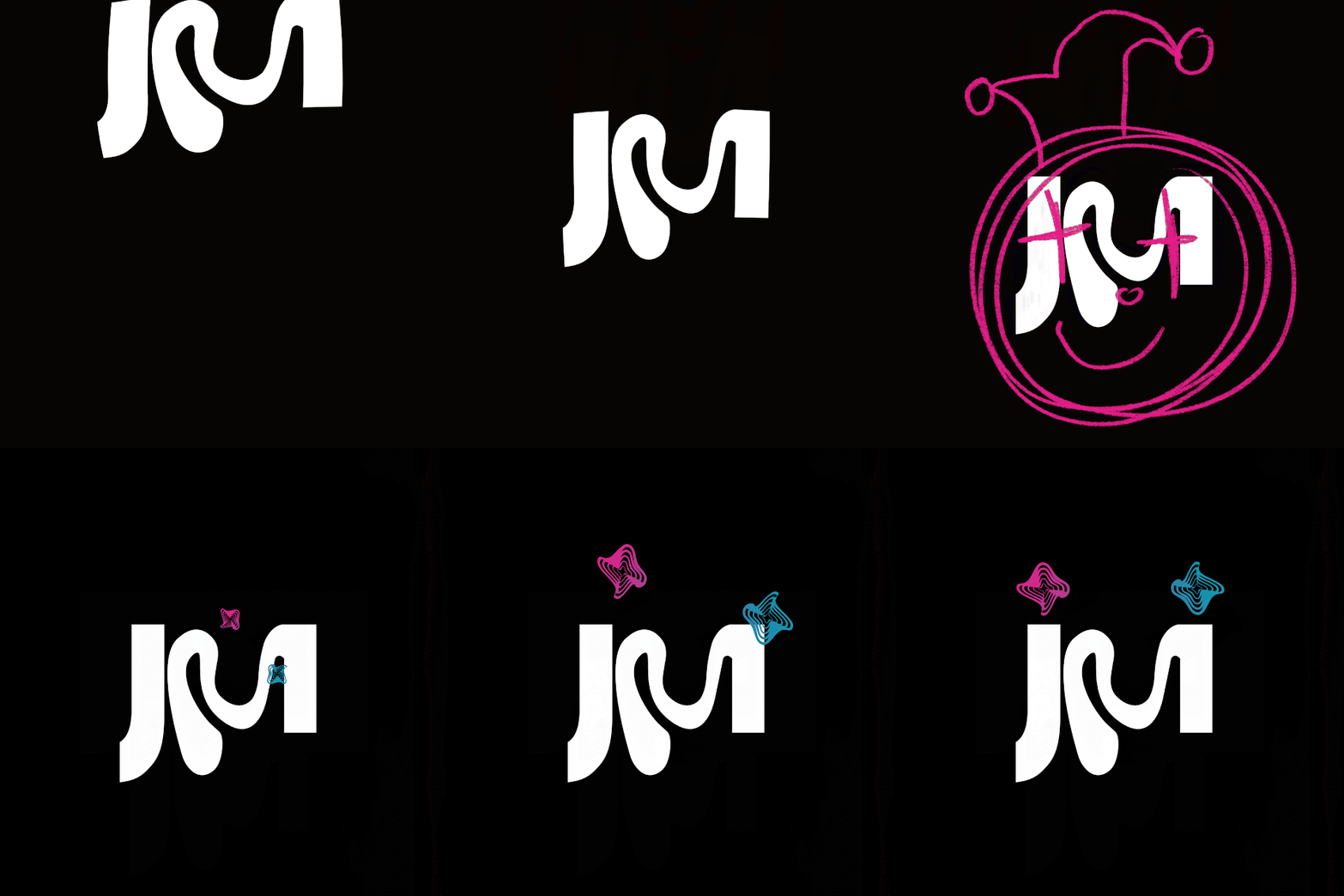
My name is Jamie, and I was thinking if I chose to use all 5 letters will be too much, hence I chose only three letters from it which also have the same pronunciation as "jmi". As I am a person who doesn't like to follow the flow and also try to achieve that, I always wanted to show and find the real me. I added some weirdness to it as (maybe) I am a weird person (my parents and friends told me). For the "dots" I used distorted circles to replace them, it represents my far-apart eyes and it also somewhat looks like a clown's eyes / Jack's eyes (from Jack In The Box). The reason I chose Jack In The Box as one of my design elements, is it represents hope and freedom, which is always what I wanted to achieve. I think having hope is one of the motivations that drive me to move forward.
Colored version (PNG file):
fig 24: final outcome colored (week 6/ 05/10/2022)
Collateral final outcome:
fig 26: final notebook set (week 9/ 25/10/2022)
fig 27: final sticker pack (week 9/ 25/10/2022)
fig 28: final sticker tape (week 9/ 25/10/2022)
PDF file:
Animation final outcome:
fig 29: animation final outcome in gif (week 9/ 25/10/2022)
fig 30: animation final outcome in mp4 (with sound effects) (week 9/ 25/10/2022)
The final outcome (IG post):
fig 31: IG post layout screenshot (week 10/ 2/11/2022)
Task 3/ Type Exploration and Application
19/10/2022 - 23/11/2022 (Week 8-Week 13)
Application outcome:
fig 33: poster application (week 13/ 23/11/2022)
I wanted to make a poster that includes some of Malaysia's features in it, hence I added some batik patterns for the background as well as the front part. The reason I chose this color palette is I thought that red color represents the rock band, while yellow also is one of the colors in Jalur Gemilang. Furthermore, I wanted to make it more vintage and retro-like, so I toned down the red and yellow.
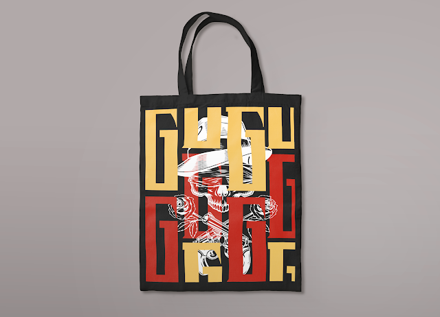
fig 34: G tote bag application (week 13/ 23/11/2022)
So for the merchandise, I was planning to make something that the official band hasn't released yet. Tote bag is a really typical merch for concerts, so I chose it as my 1st merch.
fig 35: U guitar pick application (week 13/ 23/11/2022)
I chose the guitar pick as I think it's collectible and represent the rock band too, it is suitable for people who love Guns N' Roses as well as music too.
fig 36: N & S scrunchies application (week 13/ 23/11/2022)
Scrunchies can use to tie hair and also as a bracelet, as nowadays people love to use scrunchies as part of their accessories, hence I was thinking the audience can wear them in the concert to match the vibes.
fig 37: R pillow application (week 13/ 23/11/2022)
Pillow is something that can use as a decoration for a bedroom or anywhere else, as most of the merchandise I created is wearable and can bring outside, so I decided to add one that can use at home.
fig 38: O skateboard application (week 13/ 23/11/2022)
Skateboard is something quite trending now, and it is a collectible item too. Skateboard is representing freedom, so I thought that quite matches the vibe of the music genre.
fig 39: E zippo lighter application (week 13/ 23/11/2022)
Zippo lighter is something looks really exclusive, a collectible vintage item for the fans. As Guns N Roses is an 80s rock band, I decided to add one merch related to the 80s too.
In total, I made 6 merch but using different letters to form the pattern, and all the merch are in following the sequence of GUNS N ROSES. I used the letter G for the tote bag, the letter U for the guitar pick holder, the letter N, and S for the scrunchies, the letter R for the pillow, the letter O for the skateboard, and the letter E for the zippo lighter.
PDF:
FINAL REFLECTIONS
Experience
Throughout this whole semester, the most challenging part it there were too many assignments to do (not just for this module). Specifically for this module, the biggest challenge for me is learning new things, because this is a module followed after the 'Typography' module, hence the lecturer will expect that we have the base and foundation using the software and skills, thus, lots of things we need to explore by ourselves. Furthermore, we need to be very alert in submissions, requirements and so on, as we are already second-semester students, we need to be very alert and independent, we can't rely on the lecturer anymore. To be honest, I quite enjoy this module this semester, although at first, it was quite scary and frustrating, in the end, I'm still happy with how the final outcome came out.
Observations
I found out during this semester the lecturer provides us quite a freedom in making decisions, hence we need to be very decisive and independent in managing our time. Being detailed is important, even the smallest mistakes can affect a lot. Sometimes before starting a design, doing research helps a lot, it provides a lot of information and inspiration.
Findings
Although it's quite hectic this semester, I think it's quite fun and I do learn a lot as we need to do all the things by ourselves. Sometimes I can be really indecisive which makes my progression kind of slow, I really hope I can improve in being more decisive and critical.


Comments
Post a Comment